Visual Designer and
Creative Team Player
East Van Jam
Founder and entrepreneur Natalie Ferrari-Morton, asked me to create a brand design and collection of labels for multiple flavors of jam. My illustrative style was a substantial factor in the branding with each jam flavor showcasing an original character.


Labeling
The client wanted a collection of characters to represent the jam flavors. They were looking for hand-drawn illustrations of faces with a playful, vintage feel. A small budget and few printing options limited us to black-on-white printing. I enjoyed that constraint and turned it into striking labels that popped against the vibrant color of the jams.


Round 2
After a few years of success and market feedback, we tried a new approach: transparent labels to allow more jam color to show and prominently listing the fruit flavor. The addition of a tamper seal gave me a chance to add an extra splash of color.


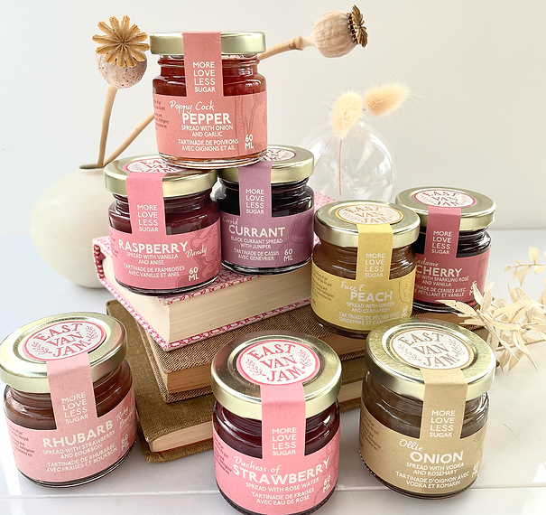
Round 3
Several years down the road, East Van Jam came back to me for another label update. The grocery store shelf is a different environment to sell a product than a boutique craft shop. The challenge was to add saturated color labels with the East Van Jam logo on the front of each label. We worked together on a color palette that softened the illustrations’ prominence, and made the individual flavors stand out. I also integrated a custom die shape with the tamper seal as an extension of the label.

Branding
I approach brand-building in a collaborative way. For East Van Jam, we were able to develop a logo with a hand-crafted, stamp-like feel, yet very visually impactful. We landed on this hand-lettered motif featuring subtle symmetry, loose drawing and a nod to vintage, botanical themes.


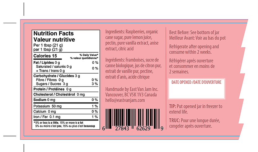
Label Data
A label needs to draw attention, create an identity, and clearly communicate what’s inside. It also has to accommodate a lot of practical information. We quickly worked through countless iterations and edits to get all the pieces to fit correctly. Since this was product for a Canadian market, that included duplicating some of the copy in French.